Feature
Detailed Summary
of Privacy Policies
Transformed complex, multi-page legal policies into, simple, understandable and unified user experience.

The challenge
How might we spark people's interest in the usefulness of the Pro Se app?
Goal 2
Instead of complex views, make simplified data analysis in the way that results are understandable at first sight.
Redesigned Features
01
Solving "Scroll Fatigue" in Privacy Policies
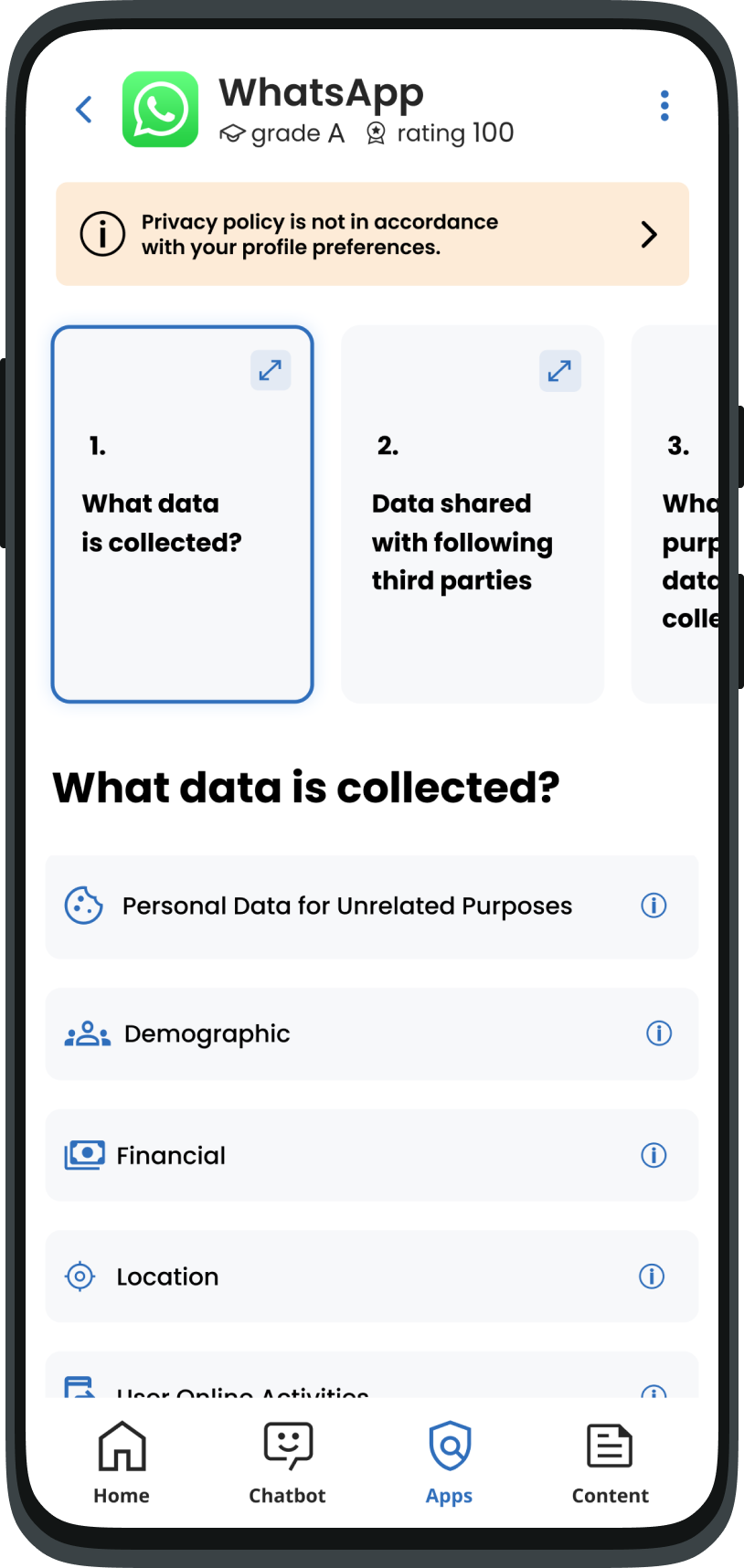
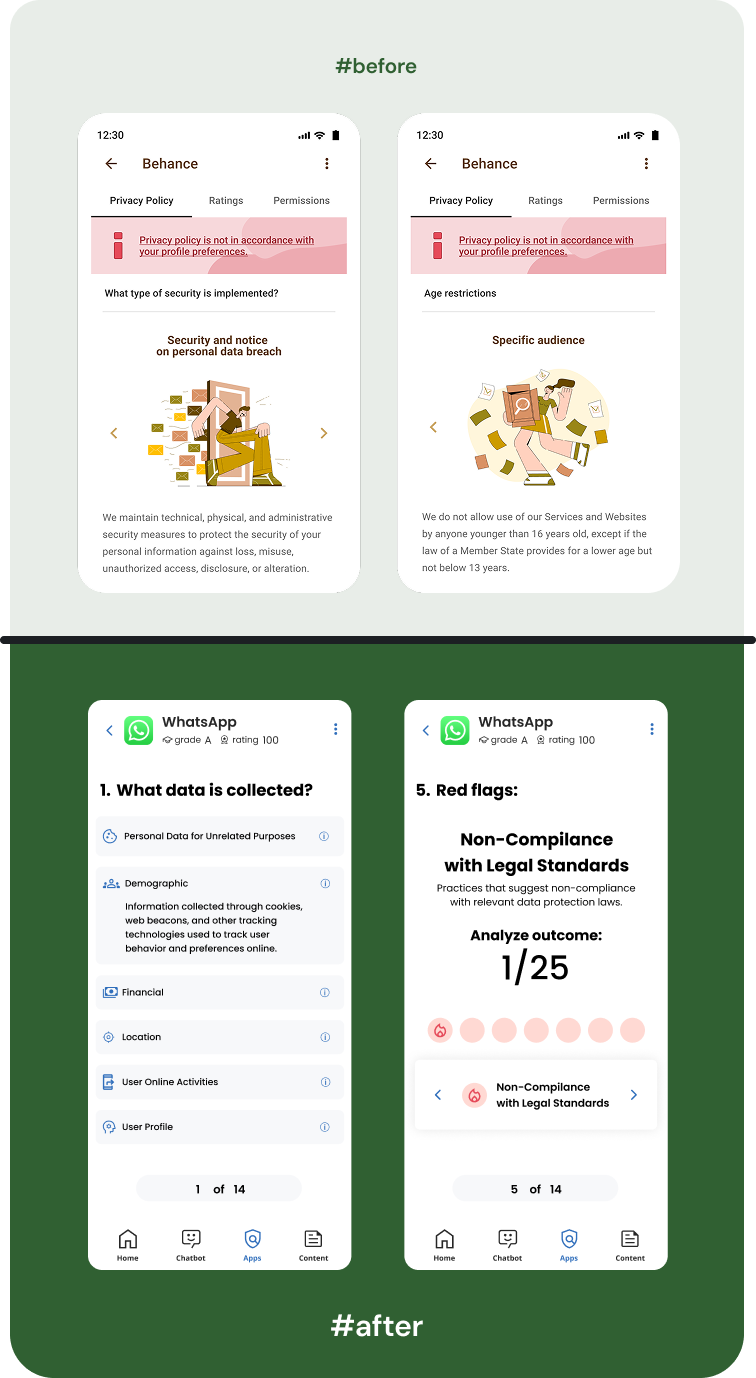
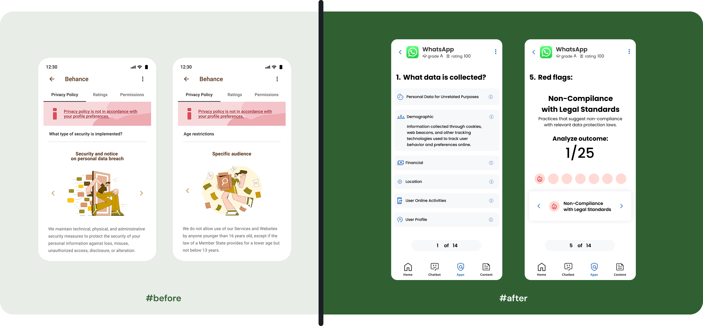
In the original design, the privacy summary was just a long, boring list with big pictures that didn't help the user. This created "Scroll Fatigue," where users got tired and stopped caring. To fix this, I applied the rule that we shouldn't put everything on one screen. I organized the data into clean sections and added progress indicators so users always know how many steps are left and if they missed any important details.
I believe in keeping screens clean and focused. Since modern users are already used to swiping and scrolling, I used those natural movements to hide the "noise" and show information only when it is needed. This reduces the mental effort for the user and turns a "monotonous list" into an easy, organized journey.
Progressive Disclosure
Cognitive Load
Privacy by Design
02
Profile Onboarding Settings (Problem & Solution)
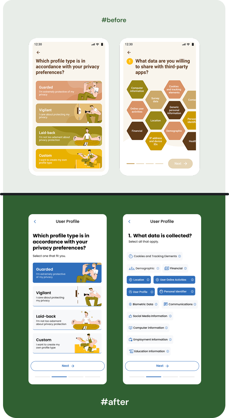
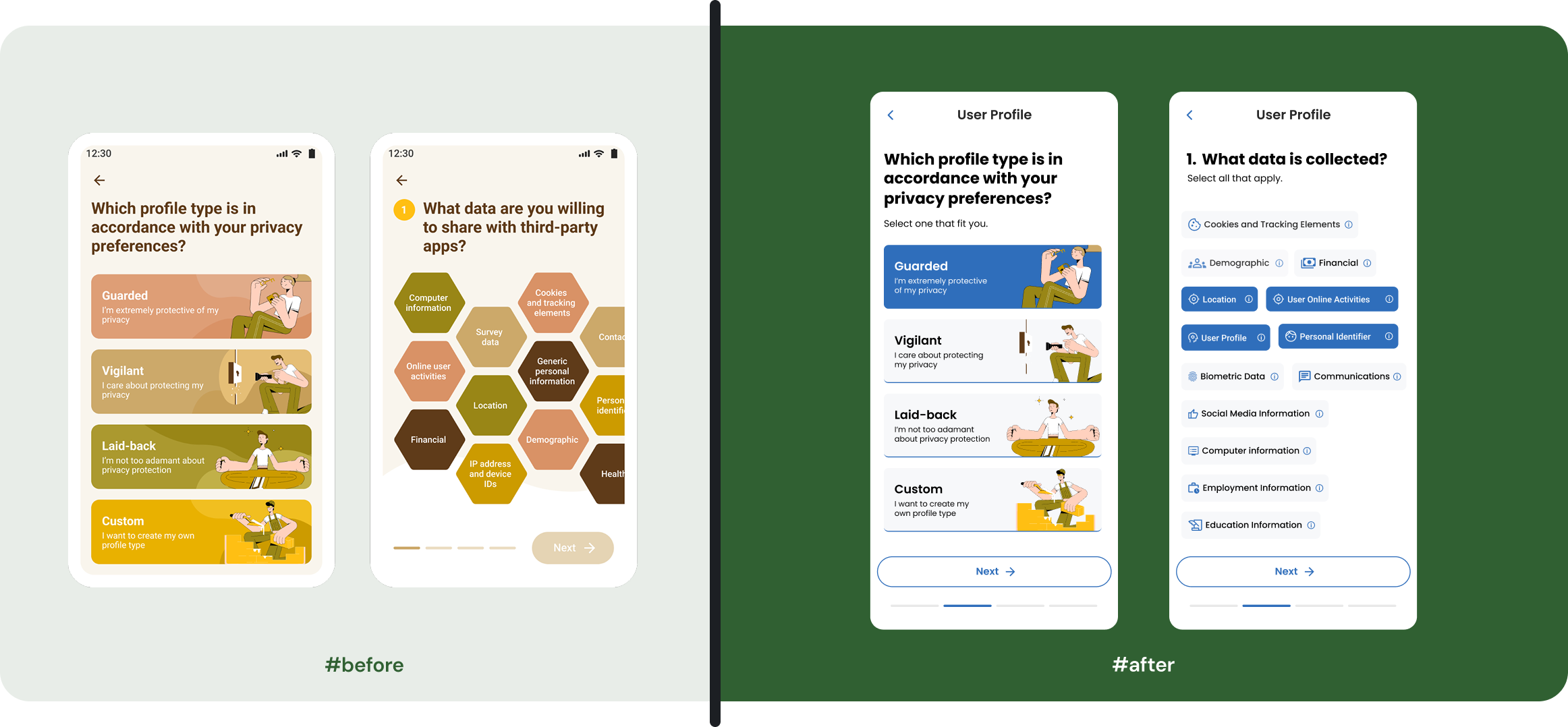
Users felt that choosing their interests (tags) was slow and frustrating. We used a "hexagonal" (six-sided) layout that looked interesting but was actually very hard to read. Because the shapes were non-standard, users couldn't "scan" the screen quickly, causing them to get stuck during the first few minutes of using the app.
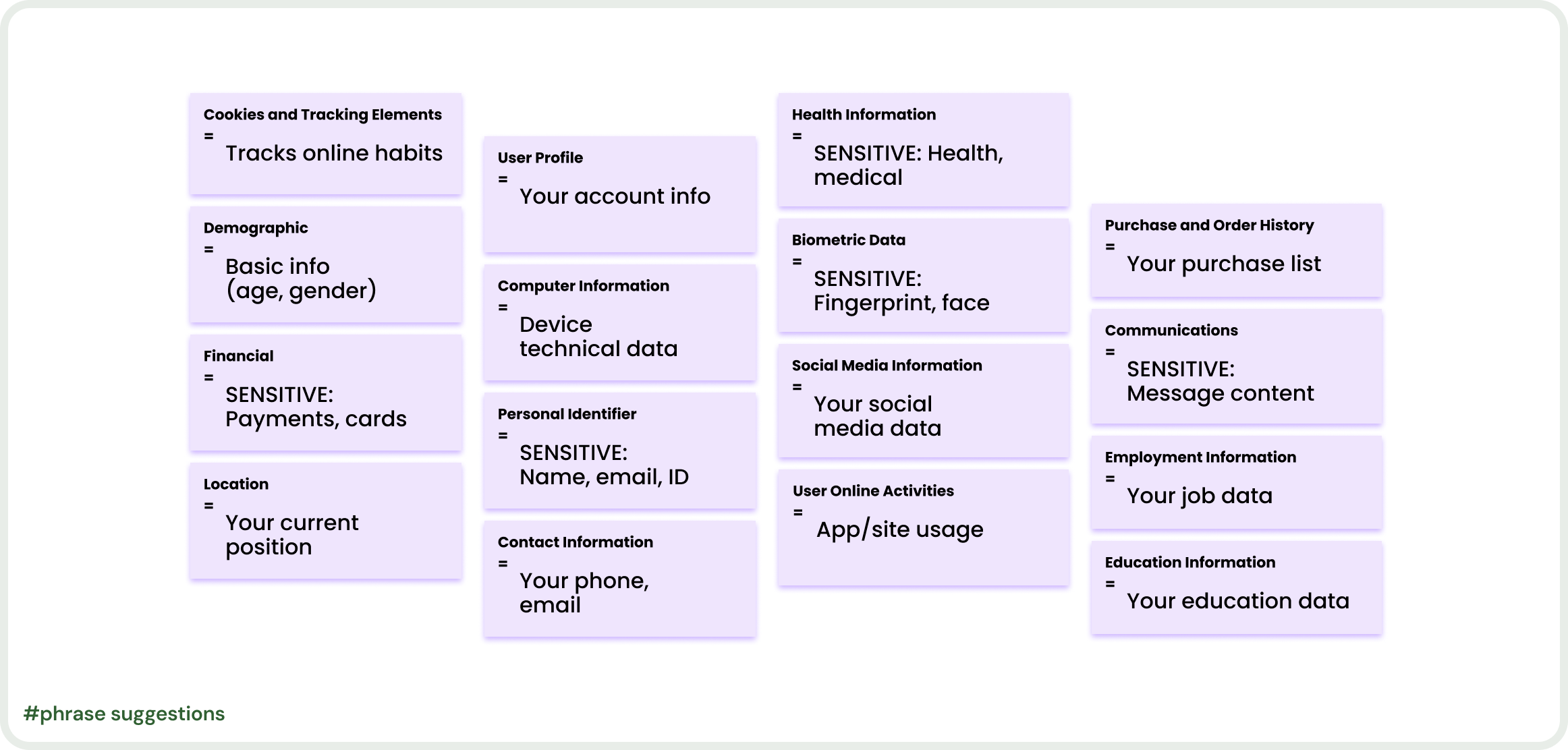
I redesigned the tags to focus on speed and instant understanding. I added meaningful icons to each tag so users can recognize the topic without even reading the text. I also used clear, simple colors to improve visibility and added tooltips to give more explanation for complex choices. By moving away from "fancy" shapes to a clean, standard layout, I turned a confusing step into a fast and simple journey.
Visual Scannability
Standardized UI Layouts
Onboarding Optimization
Iconography Systems
Cookies and Tracking Elements
=
Tracks online habits
Health Information
=
SENSITIVE: Health, medical
Biometric Data
=
SENSITIVE: Fingerprint, face
Social Media Information
=
Your social media data
Employment Information
=
Your job data
Education Information
=
Your education data
Purchase and Order History
=
Your purchase list
Communications
=
SENSITIVE: Message content
Location
=
Your current position
User Online Activities
=
App/site usage
Demographic
=
Basic info
(age, gender)
Financial
=
SENSITIVE: Payments, cards
Personal Identifier
=
SENSITIVE: Name, email, ID
User Profile
=
Your account info
Computer Information
=
Device technical data
Contact Information
=
Your phone, email
#phrase suggestions
Next Project
View All Projects →
Home
About
Case Studies
Contact
Feature
Detailed Summary
of Privacy Policies
Transformed complex, multi-page legal policies into, simple, understandable and unified user experience.

The challenge
How might we spark people's interest in the usefulness of the Pro Se app?
Goal 2
Instead of complex views, make simplified data analysis in the way that results are understandable at first sight.
Redesigned Features
01
Solving "Scroll Fatigue" in Privacy Policies
In the original design, the privacy summary was just a long, boring list with big pictures that didn't help the user. This created "Scroll Fatigue," where users got tired and stopped caring. To fix this, I applied the rule that we shouldn't put everything on one screen. I organized the data into clean sections and added progress indicators so users always know how many steps are left and if they missed any important details.
I believe in keeping screens clean and focused. Since modern users are already used to swiping and scrolling, I used those natural movements to hide the "noise" and show information only when it is needed. This reduces the mental effort for the user and turns a "monotonous list" into an easy, organized journey.
Progressive Disclosure
Cognitive Load
Privacy by Design
02
Profile Onboarding Settings (Problem & Solution)
Users felt that choosing their interests (tags) was slow and frustrating. We used a "hexagonal" (six-sided) layout that looked interesting but was actually very hard to read. Because the shapes were non-standard, users couldn't "scan" the screen quickly, causing them to get stuck during the first few minutes of using the app.
I redesigned the tags to focus on speed and instant understanding. I added meaningful icons to each tag so users can recognize the topic without even reading the text. I also used clear, simple colors to improve visibility and added tooltips to give more explanation for complex choices. By moving away from "fancy" shapes to a clean, standard layout, I turned a confusing step into a fast and simple journey.
Visual Scannability
Iconography Systems
Standardized UI Layouts
Onboarding Optimization